How to create a new Flutter Project with a Boilerplate | Part 2

Using the Features of the Boilerplate Template
In the second part of the tutorial, we are going to make example implementations of the three main features that I think are the most independent of external information or resources for now. These examples will help you navigate through template structure and make you get accustomed to its working environment.
- Splash Screen
- Routing / Navigation
- Dark & Light Theme
Splash Screen:
In case you don’t know, Splash Screen is the first screen that appears when the application is started. You can picture it as the welcome page or first page of your presentation.
Two key reasons for using a splash screen is to have an authentic welcome screen with or without animation that grabs the user right at the start, and the other is to use the extra time during Splash Screen is shown to fetch important data from API or database.
In this example we are going to go through each step of building a splash screen.
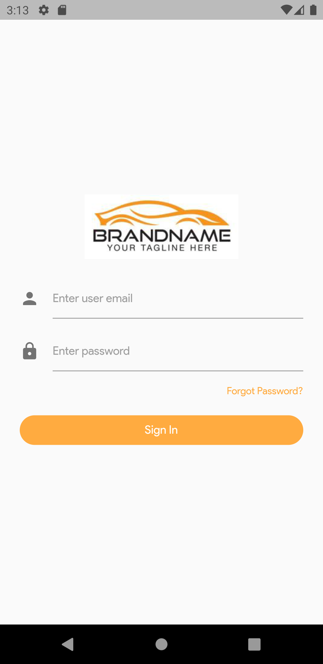
Once you start debugger, the first screen you should see will be the login screen.
Now let’s try to find the splash screen and make some changes.
If you have read the original documentation, you should have some idea how to locate the splash screen inside the folders.
If not, follow this route:
flutter-app/
|- android
|- build
|- ios
|- lib/
    |- constants/
    |- data/
    |- di/
    |- models/
    |- stores/
    |- ui/
        |- splash/
            splash.dart
    |- utils/
    |- widgets/
    |- main.dart
    |- routes.dart
|- test
Inside the splash screen, there are three main functions that makes the splash screen work.
1. startTimer()
2. initState()
3. navigate()
Basically startTimer returns a Timer widget which accepts 2 arguments. First argument is the duration variable and the second argument is a function.
In this case duration is how long the splash screen will be shown to user before running the function, and the function is navigate() that has a routing logic. Finally, initState() is where the startTimer() function will be triggered each time the splash screen is called.
Note: Normally initState() is a Life Cycle method, therefore we will not make any changes with it. Additionally, you can head to this YouTube tutorial from Robert Brunhage, to learn more about lifecycle methods.
To customize the duration of splash screen, change the milliseconds property.
startTimer() {
   var _duration = Duration(milliseconds: 2000);
   return Timer(_duration, navigate);
 }
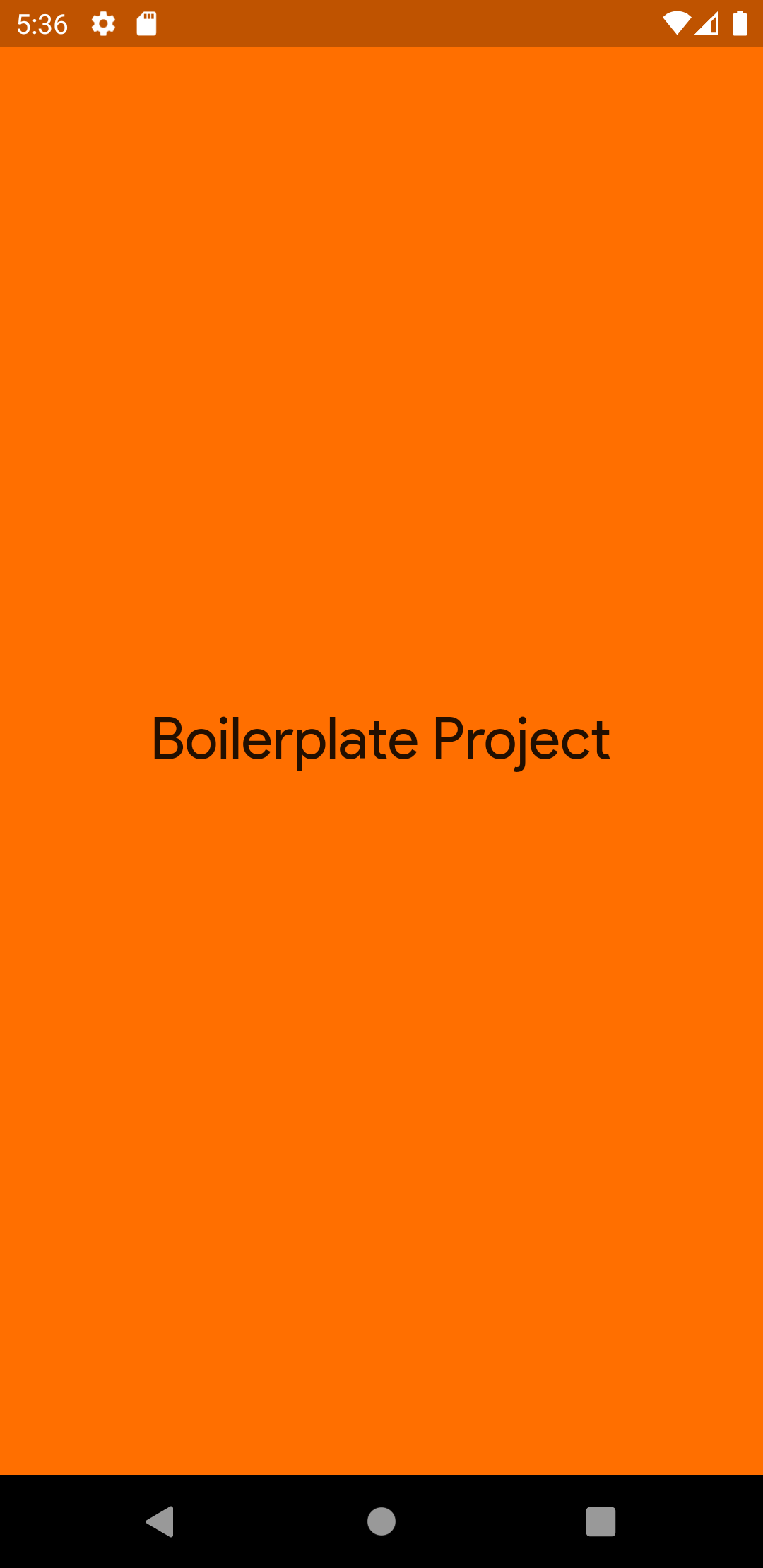
Then, to change the splash screen UI, head to the build function inside the SplashScreen widget and change the child of the Material widget.
 @override
  Widget build(BuildContext context) {
    return Material(
      child: Container(
          color: Colors.amber[900],
          child: Center(
              child:
                  Text("Boilerplate Project",
                        style: TextStyle(fontSize: 30)))),
    );
  }
Instead of an Image widget, I changed the child widget of Center into a Text widget.
In addition, if you are interested in changing the navigation of splash screen, change the Route name inside the navigate() function. If you don’t have any clue where these Route names comes from, head to the Routing section for further information.
By default, navigation function has a conditional feature that checks if the user is logged in or not, and navigates the user to either home or login screen based on the logged in status. It is up to you to keep this logic or change the function to your liking.
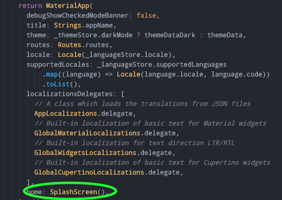
One last thing before splash screen to take effect is to change the home property of the MaterialApp widget inside main.dart.
Head to lib ⇨ main.dart and locate MaterialApp widget inside MyApp widget and change the home property to SplashScreen().
Now hot reload or hot restart the emulator to see the new splash screen you have just implemented!
Routing:
In standard routing, the navigation path is stated inside navigator function such as '/folder/file' structure.
The Routing method used in this boilerplate template is to store all the routes inside a class and call them from this class with a predefined route name. Let’s take a look at the routes.dart for better understanding.
Go to lib ⇨ routes.dart and open up the file.
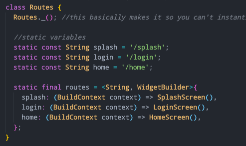
This is the template version of Routes class. Let’s add an example route to go through each step.
-
Inside lib ⇨ ui create a new folder called ‘base’
-
Add a new file called base.dart
-
Create a stateful widget name BaseScreen inside the file and add a Text widget to visualize the screen

-
Go back to routes.dart and create a static constant variable named base
static const String base = '/base';
- Add base variable into the routes Map as a key and add Builder method as value.
base: (BuildContext context) => BaseScreen(),
- Finally, let’s test it by adding the BaseScreen() route into navigate() method inside Splash screen.
navigate() async {
     Navigator.of(context).pushReplacementNamed(Routes.base);
 }
Note: I have deleted the Preferences.is_logged_in condition for simplicity, so the app will always go to base screen after splash screen. You may keep this logic and define is_logged_in by copying the code below and changing true or false inside your desired method.
  SharedPreferences.getInstance()
       .then((prefs) => prefs.setBool(Preferences.is_logged_in, true));
Now hit the hot restart! If you did every step right, then you will be directed from SplashScreen to lovely looking base screen.
Dark & Light Theme
One of my favorite features in the modern day applications is the dark theme, and I am sure most of you can relate the pain of looking at a bright light screen in the middle of the night. Dark theme is good for the eyes, it looks damn cool, and it is unbelievably easy to implement. So, let’s discover the secrets of the dark theme…
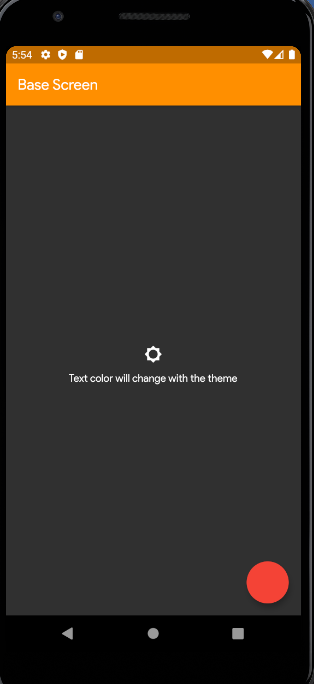
Now that we have our base screen, at the moment it is completely blank. Let’s create a basic UI layout to understand how dark & light theme works.
Either add this widget into the build method or create a basic layout of your own choice.
 Scaffold(
      appBar: AppBar(
        title: Text('Base Screen'),
      ),
      body: Column(
        mainAxisAlignment: MainAxisAlignment.center,
        children: [
          IconButton(
            onPressed: () {},
            icon: Icon(
              Icons.brightness_5,
            ),
          ),
          Center(
            child: Text(
              'Text color will change with the theme',
            ),
          )
        ],
      ),
    );
On this basic screen we will implement functionalities one by one.
Theme functionality is being handled by the mobx stores. These stores will be explained in detail on the upcoming section under MobX state management. For now let us know that all these functionalities are in some dedicated place called stores, and we are going to access that store to use these functionalities.
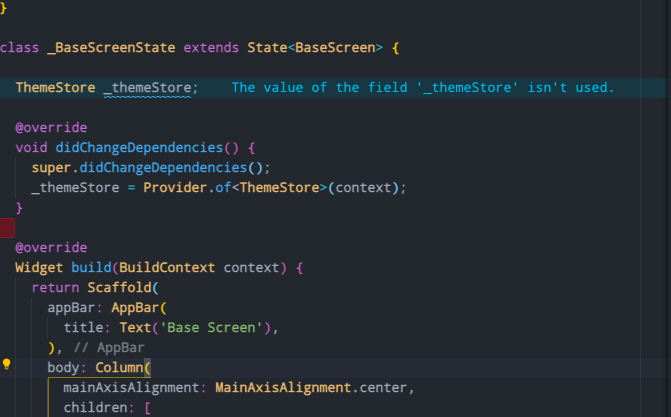
- Bring the store into base.dart
First we need to bring an instance of the store into the base.dart to use the functions inside this store. Create a variable before the build method called _themeStore.
ThemeStore _themeStore;
Next create didChangeDependencies method right under the variable.
@override
 void didChangeDependencies() {
   // TODO: implement didChangeDependencies
   super.didChangeDependencies();
 }
Inside this lifecycle method we are going to call the _themeStore by the help of the provider package. The reason we are using didChangeDependencies method is to bring the store via Provider every time some values change in the store. If you are still not familiar with life cycle methods, I highly recommend taking a look at this amazing video.
  @override
  void didChangeDependencies() {
    super.didChangeDependencies();
    _themeStore = Provider.of<ThemeStore>(context);
  }
This will be the final outcome.
- Use the functions of the store inside base.dart
The idea behind using the store is to control the state of the selected theme all over the application. This means that the state of the theme changed in base.dart will be reflected to the other screens, widgets and any part of the project that is on the presentation layer.
In this example we will create a button that changes the theme of the app. Under onPressed function in IconButton, let’s call the function below.
onPressed: () {
              _themeStore.changeBrightnessToDark(!_themeStore.darkMode);
            },
This method, calls the changeBrightnessToDark method from _themeStore and changes the values of the darkMode. To further understand this method you can check it under the original store file theme_store.dart.
flutter-app/
|- android
|- build
|- ios
|- lib/
    |- constants/
    |- data/
    |- di/
    |- models/
    |- stores/
      |-theme
        |-theme_store.dart
|- test
Nevertheless, it is better to leave the stores aside for now and return to them once we go through MobX state management and how the stores work.
Alright, everything is set. Now let’s give it a try by pressing the button.

Magic… Well, If you think it is done by magic as I did for the first time, sadly the answer is no.
So how does this dark mode actually work? How does it know which color to change?
- Customizing theme colors
Flutter handles the overall theme of the app under theme property in MaterialApp widget. Theme property takes one argument that is a ThemeData class. This class has all the properties that can be customized to create an overall theme for the applications from text styles to variety of colors.
So in general, by pressing the button that changes the theme, we are actually running a boolean function that says if the theme is dark then use themeData for darkTheme, if not use themeData for light theme. This also means that you can create and implement multiple themes on your own once you create, define and customize a theme under ThemeData class.
Let’s take a closer look on the ThemeDate objects in the boilerplate.
Head to app_theme.dart
flutter-app/
|- android
|- build
|- ios
|- lib/
    |- constants/
      |-app_theme.dart\
You will see two predefined themeData objects inside here. ThemeData class comes with tons of properties that can be customized to create a unique theme for the applications.
final ThemeData themeData = new ThemeData(
    fontFamily: FontFamily.productSans,
    brightness: Brightness.light,
    primarySwatch: MaterialColor(AppColors.orange[500].value, AppColors.orange),
    primaryColor: AppColors.orange[500],
    primaryColorBrightness: Brightness.light,
    accentColor: AppColors.orange[500],
    accentColorBrightness: Brightness.light
);

final ThemeData themeDataDark = ThemeData(
  fontFamily: FontFamily.productSans,
  brightness: Brightness.dark,
  primaryColor: AppColors.orange[500],
  primaryColorBrightness: Brightness.dark,
  accentColor: AppColors.orange[500],
  accentColorBrightness: Brightness.dark,
);
- Usage of theme colors
Now I would like to go ahead and change some colors to see how the application responds to the changes. Change the dark theme as in below.
final ThemeData themeDataDark = ThemeData(
  fontFamily: FontFamily.productSans,
  brightness: Brightness.dark,
  primaryColor: Colors.amber[800],
  primaryColorBrightness: Brightness.dark,
  accentColor: Colors.red,
  accentColorBrightness: Brightness.dark,
);
Now, add a floating action button just as blank widget inside Scaffold in base.dart
Scaffold(
      floatingActionButton: FloatingActionButton(onPressed: (){}),
Always remember to press hot restart after changing something related with the theme. Press hot restart and here we go…
Basically, the primary color is used in AppBar and the accent color (which is the second color) is used in FloatingActionButton. This concept is designed by google as a design guideline called Google Material Design and embedded inside Flutter material design by default, which means, even by changing only those two colors you can still create a nice looking theme.
However, we can even further change the colors of anything with the theme colors. Let’s change the color of the icon with the primary color.
icon: Icon(
              Icons.brightness_5,
              color: Theme.of(context).primaryColor,
            ),
Cool, right? This method can be used in any changeable color to implement theme colors.
- Conditions based on Theme
Last but not least, you can even do more, such as adding conditionals to change Widgets based on the selected theme.
In this example, I would like to change the icon when the theme changes. To be able to do that, we just need a boolean variable that tells us it is either dark or light theme. Luckily this boolean variable is already defined in our boilerplate inside theme_store.dart.
Let’s go ahead and use a ternary operator inside Icon widget to change the type of the icon.
 IconButton(
            onPressed: () {
              _themeStore.changeBrightnessToDark(!_themeStore.darkMode);
            },
            icon: Icon(
              _themeStore.darkMode ? Icons.brightness_5 : Icons.brightness_3,
              color: Theme.of(context).primaryColor,
            ),
This ternary operator tells if the theme is dark mode then the Icon is brightness_5, if not then the Icon is brightness_3.
Alright, in the next and the last section we are going to go through a detailed example of how to use data, domain and presentation layers as well as understand and use Mobx and Provider packages. By the end of this series you will be able to work and navigate in your projects almost naturally.
This boilerplate template is made by Zubairehman. All credit goes to him for preparing an exceptional starting point for a business level Flutter projects.