Custom Neumorphic Shapes in Flutter
Introduction
A good design is an essential part of a good mobile application. Honestly, a developer doesn’t have to concern about a good design. Still, if you are interested in some kind of UI that stands out your home page or if you are just interested in building UI with a style, then It is a good practice to follow the design trends.
Besides, having design knowledge as a developer will always always be welcomed in any team of developers.
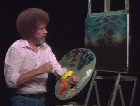
Or without a one, you might end up having a functionally working abomination like this…
In this tutorial, I am going to explain what is neumorphic design and how to implement it in your Flutter applications.
For this reason, let’s have a quick look at what neumorphism is all about.
Neumorphic Design
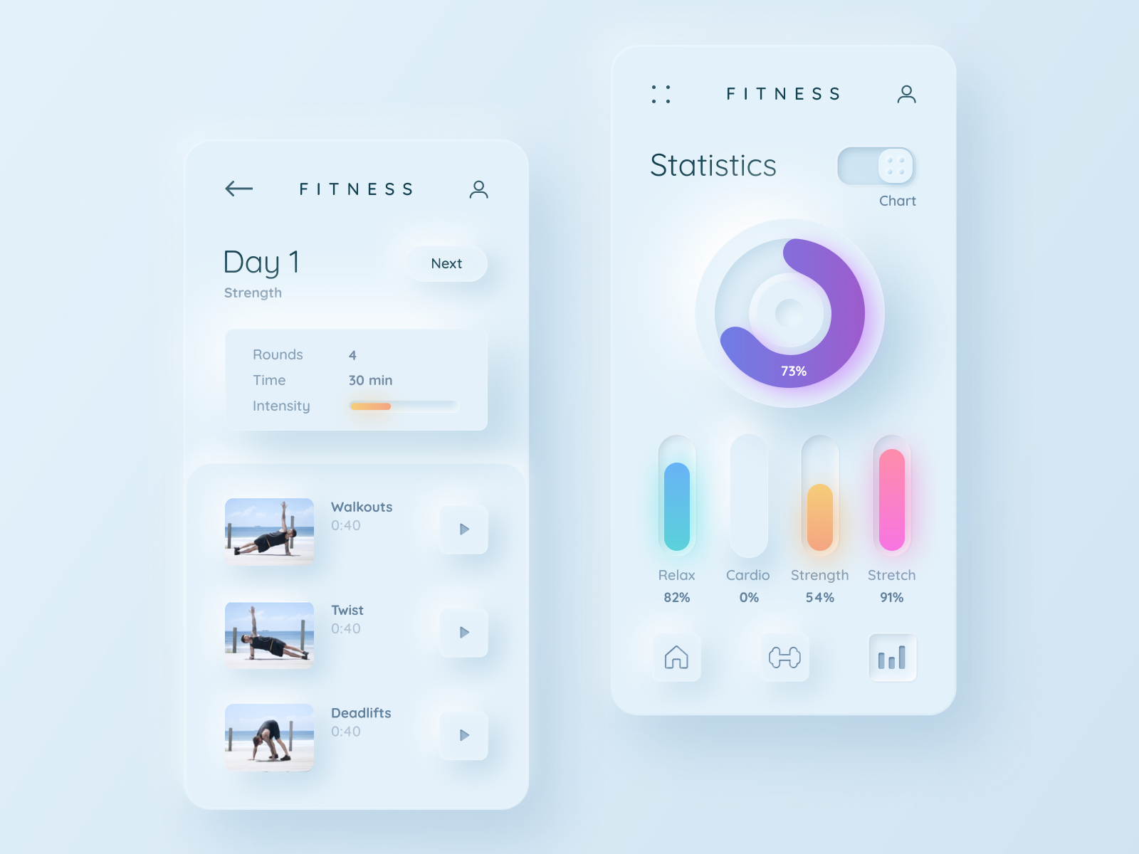
Neumorphic design example by Mary Tokar on dribble.
Neumorphism has become one of the hottest mobile design trends in 2020, and it still keeps its popularity throughout 2021.
It is a design trend that is focused on creating solid-looking components with the help of colors, low contrast, and shadow effects.
The way the style is implemented gives the user the feeling of depth where the components look like they are actually inside the background but not just placed on it.
The main ingredient for this style is making sure that your element and your background are the same exact color. This is so that we can then create the feel that these components are coming out from inside the background, using shadowing to create the protruding look.
In addition, for the shadow game to work, your background can’t be fully black or plain white.
You’ll need some sort of color, in order for the shadow to deliver on the visual trick. Once you have the main color, you can then look for two shadows: dark and light shadow.
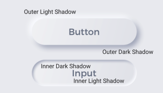
Dark and light shadow on the main color creates this elevated or embedded feeling to your component, and it is the final key information to know when creating neumorphic shape.
Furthermore, check out this interactive neumorphism generator to experiment with shadows and colors.
Creating a Custom Neumorphic Shape In Flutter
Now It is time to put the information into practice.
In order to create custom Neumorphic Shapes in Flutter, we are going to use a Web App called ‘Flutter Shape Maker’ and a Flutter package called ‘flutter_neumorphic’.
Creating a Custom Shape
In Flutter the most popular way of creating a custom shape is to use the CustomPaint widget. It basically helps the developer to create any kind of shape with an exchange of some kind of headache.
As you may know, there is always someone out there to make things easier for the rest of the Flutter developers, and RetroPortal Studio is one of them who created this super useful website to create CustomPaint shapes easily.
Now let’s head over to Flutter Shape Maker website.
You will see that there are two methods.
The first one is to create any given SVG image to a CustomPaint code.
The second one is to create your own shape.
In this tutorial I am going to create a custom button that looks like a minimalist cloud…at least I will try…
You can either experiment on your own or, head over to this tutorial by the creator of this application to further understand how to create a custom shape.
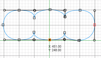
Alright, mine is done and doesn’t look that bad. After you finish creating the shape as well, click on the Get Code button on the right-side panel and copy the custom painter code.
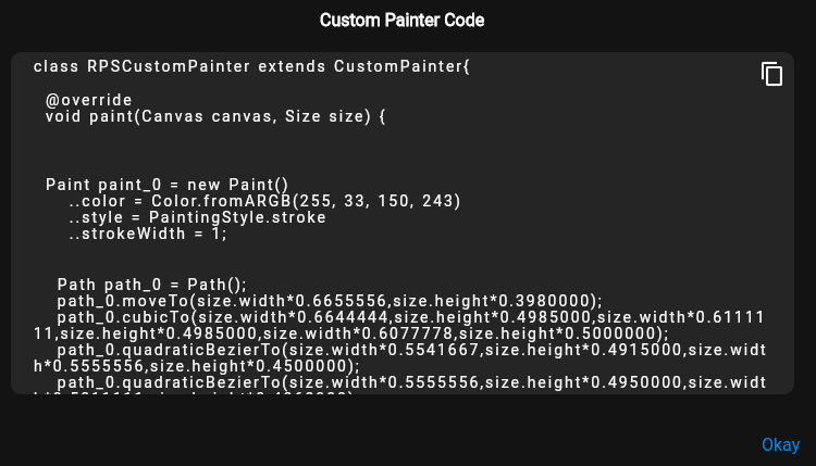
The next step is to add the custom shape code to your existing project or a new flutter project.
Create a new file called custom_shape.dart inside the lib folder and paste the code inside the file.
Inside the RPSCustomPainter class, change the style to fill the shape.
..style = PaintingStyle.fill
It’s done. Now you can create a CustomPaint widget in your dedicated screen and wrap it with a Container to give the preferred size.
  Container(
              width: 600,
              height: 300,
              child: CustomPaint(
                painter: RPSCustomPainter(),
              ),
            )
Implementing Neumorphism Package
Let’s begin by importing the neumorphic package to pubspec.yaml.
dependencies:
  flutter:
    sdk: flutter
  flutter_neumorphic: ^3.1.0
Before making the necessary implementations, you can head over to the package’s original API documentation to see all the different shapes and features that this package provides. In this tutorial, we are only going to go through the custom shape implementation.
First, we need to create a NeumorphicPathProvider that provides the custom shape into the Neumorphic widget.
In order to do that, go to custom_shape.dart and create the class below.
class MyShapePathProvider extends NeumorphicPathProvider {
  @override
  bool shouldReclip(NeumorphicPathProvider oldClipper) {
    return true;
  }

  @override
  Path getPath(Size size) {
    Path path_0 = Path();
    //paste your path here
    return path_0;
  }

  @override
  bool get oneGradientPerPath => false;
}
Copy the path from RPSCustomPainter and paste it.
class MyShapePathProvider extends NeumorphicPathProvider {
  @override
  bool shouldReclip(NeumorphicPathProvider oldClipper) {
    return true;
  }

  @override
  Path getPath(Size size) {
    Path path_0 = Path();
    path_0.moveTo(size.width * 0.6655556, size.height * 0.3980000);
    path_0.cubicTo(
        size.width * 0.6644444,
        size.height * 0.4985000,
        size.width * 0.6111111,
        size.height * 0.4985000,
        size.width * 0.6077778,
        size.height * 0.5000000);
    path_0.quadraticBezierTo(size.width * 0.5541667, size.height * 0.4915000,
        size.width * 0.5555556, size.height * 0.4500000);
    path_0.quadraticBezierTo(size.width * 0.5555556, size.height * 0.4950000,
        size.width * 0.5011111, size.height * 0.4960000);
    path_0.quadraticBezierTo(size.width * 0.4447222, size.height * 0.4960000,
        size.width * 0.4433333, size.height * 0.4460000);
    path_0.quadraticBezierTo(size.width * 0.4425000, size.height * 0.4955000,
        size.width * 0.3888889, size.height * 0.4960000);
    path_0.quadraticBezierTo(size.width * 0.3352778, size.height * 0.4955000,
        size.width * 0.3300000, size.height * 0.3980000);
    path_0.quadraticBezierTo(size.width * 0.3352778, size.height * 0.3020000,
        size.width * 0.3888889, size.height * 0.3020000);
    path_0.quadraticBezierTo(size.width * 0.4450000, size.height * 0.3025000,
        size.width * 0.4444444, size.height * 0.3520000);
    path_0.quadraticBezierTo(size.width * 0.4466667, size.height * 0.3035000,
        size.width * 0.5022222, size.height * 0.2980000);
    path_0.cubicTo(
        size.width * 0.5547222,
        size.height * 0.3035000,
        size.width * 0.5575000,
        size.height * 0.3465000,
        size.width * 0.5566667,
        size.height * 0.3440000);
    path_0.quadraticBezierTo(size.width * 0.5583333, size.height * 0.3015000,
        size.width * 0.6122222, size.height * 0.3020000);
    path_0.quadraticBezierTo(size.width * 0.6655556, size.height * 0.3040000,
        size.width * 0.6655556, size.height * 0.3980000);
    path_0.close();
    return path_0;
  }

  @override
  bool get oneGradientPerPath => false;
}
Once you are done, head back to CustomPaint widget and wrap with the Neumorphic widget.
Now it is time to stylize and create the neumorphic feeling.
Stylize your shape
Inside Neumorphic widget, add the style property and assign it to a NeumorphicStyle.
 style: NeumorphicStyle(
                    shape: NeumorphicShape.flat,
                    boxShape: NeumorphicBoxShape.path(MyShapePathProvider()),
                    intensity: 0.7,
                    depth: 8,
                    lightSource: LightSource.topLeft,
                    shadowDarkColor: Colors.grey[700],
                    shadowLightColor: Colors.grey[50],
                    color: Colors.grey[400],
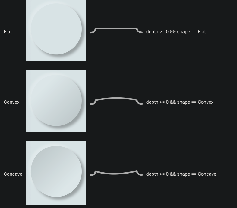
These are the most essential properties for stylizing your neumorphic shape. Let’s briefly look at all of them.
-
Shape: Flat, convex or concave
-
boxShape: This is where we are going to add our MyShapePathProvider in order to create the custom shape
-
intensity: the amount of light and dark shadow intensity / double 0.0 to 1.0
-
surfaceIntensity: The convex and concave shape intensity. (not necessary for flat shapes) / double 0.0 to 1.0
-
depth: the value to determine how close the shape to the background. minus values for inside, positive values are for outside the background feeling / double -20 to 20
-
lightSource: the position where the light should shine upon the shape
-
shadowLightColor / shadowDarkColor : self-explanatory
-
color: Color of the neumorphic shape
Remember, we need to have the same background and shape color to be able to create neumorphic feeling. For that reason, change the background color of the scaffold, the color of NeumorphicStyle, and the color of the RPSCustomPainter to Colors.grey[400].
Assign the boxShape values as in the example NeumorphicStyle class above.
boxShape: NeumorphicBoxShape.path(MyShapePathProvider()),
If you have used Colors.grey[400], then for dark and light shadow colors you can use the tones of grey color as in the example above as well.
                    shadowDarkColor: Colors.grey[700],
                    shadowLightColor: Colors.grey[50],
To finalize your style, you can play around with depth, intensity, and lightSource values.
In my case, the image below has a flat shape with 0.7 intensity, 8.0 depth, and topLeft light source.
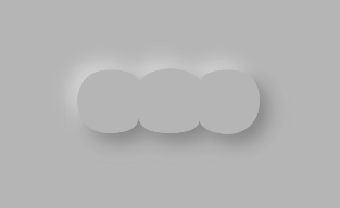
That’s it! Congratulations on creating an amazing-looking custom shape with neumorphic style.
You can follow me on Twitter and stay up to date with weekly Flutter tutorials.
Also, here is the github repository for the source code of this project.